Portfolio
-
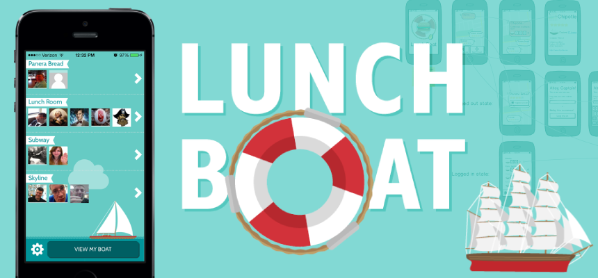
LunchBoat
My team was tasked with creating a demo application to showcase Telerik's AppBuilder, Backend Services, and KendoUI Mobile products. The outcome was a fun, lunch-logistics app that is built in HTML5, CSS3 and JavaScript and runs both on iOS and Android.
-
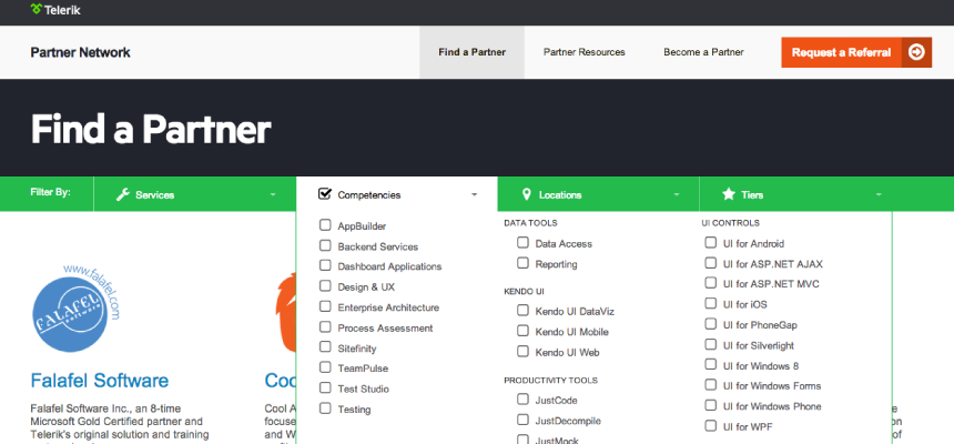
Telerik Partner Network
The Telerik Partner Network site needed to appeal to three audiences: existing partners, companies interested in becoming partners, and Telerik clients searching for partners to assist with their projects. I handled the interface design and HTML/CSS implementation. The site is built on Sitefinity CMS.
-
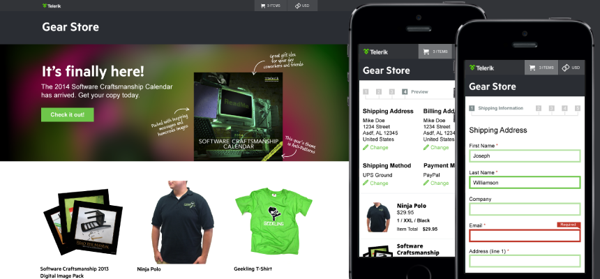
Telerik Gear Store
The aim of the Telerik Gear Store was to showcase and sell various Telerik-branded merchandise, particularly the popular Software Craftsmanship Calendar. These designs were created with the intention of showing off the merchandise while maintaining a clean UI and keeping with corporate branding standards.
-
KendoUI Dojo
This interactive tutorial-driven website allows users to explore and learn how to use Kendo UI by writing code directly in the browser. I was involved in the HTML/CSS implementation of existing designs. It has since been rebranded.
-
Chrome Camera
Implemented designs for a PhotoBooth-style application for Google using HTML5, CSS3, and JavaScript. It was shipped as the default camera application on all Chromebooks.
-
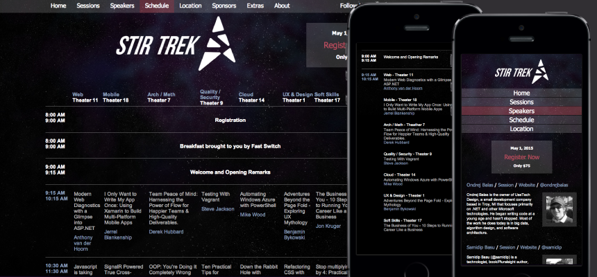
Stir Trek
This pro-bono project involved working within the existing Stir Trek website structure to optimize the experience for mobile users.
-
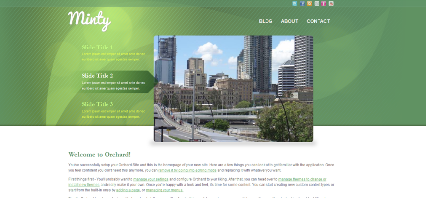
Minty
Minty is a theme that I created for Orchard CMS. Since its release in July of 2011, it has been downloaded over 13,500 times and is currently the 6th most popular theme in the Orchard theme gallery.
Public Speaking
-
Stir Trek: Ultron Edition
Designing with C.R.A.P.
Let's face it: the choices that designers make on a daily basis often seem completely arbitrary to developers. Typefaces, colors, and layouts are apparently plucked out of thin air. Why those ones? Who knows! There's a general impression that you have to be "artsy" and "gifted" to be a designer. While I'm sure that helps, the fact of the matter is that designers aren't pulling this stuff out of the ether. In fact, most design choices can be boiled down to four basic design principles. Together they're known (affectionately) as C.R.A.P., and just being aware of their existence will help you make better design judgements no matter where you rate on the dev-to-designer continuum.
See the slides || Read the Twitter feed
Internet Citizenship
If "digital natives" do exist, then I count myself as part of that population. You can find me in the following communities: